
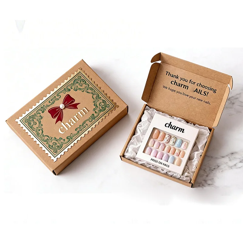
Decision 1
Compare the actual base
Put the same graphic on the proposed kraft-look and white-faced samples. Compare fine text, light colours and exposed folded edges; the brown appearance by itself does not establish fibre composition or board strength.
Decision 2
Choose the visual priority
Decide whether the paper appearance or accurate reproduction of the graphic takes priority. Record the approved substrate and print reference together so the chosen effect can be quoted as a defined combination.
Further reference views
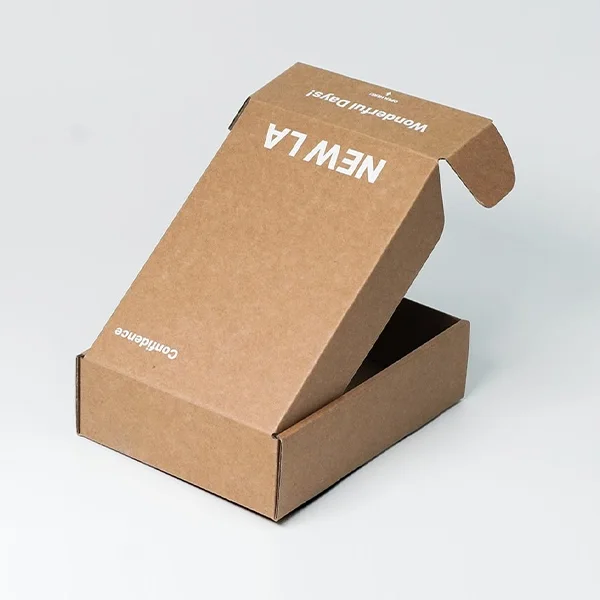
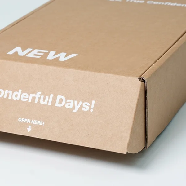
Turn the method into a sample brief
Bring the result of “compare the actual base” and “choose the visual priority” to the packaging discussion. Share the real contents, relevant drawings and the decision still to resolve.
Discuss this packaging task → (opens in a new tab or window)WhatsApp